
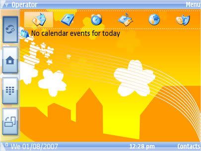
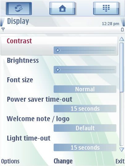
 Rumors about the forthcoming Nokia touch screen enabled device aka Nokia Tube hasn’t garnered much steam as of late, but Symbian Freak has got some leaked screen shots of what could be its touch UI to whet your appetite.
Well, as you can see, there’s isn’t much to go on here; and to be quite honest, compared to the iPhone and Blackberry, there’s still something lacking in the S60 interface in terms of wow factor. It still looks like any typical (read: boring) S60 UI with the exception of the 3 main buttons located at the top which Nokia fan boys are quite familiar with considering its extensive use in the present line of mobile phones.
So just take this sneak peek with a grain of salt as nothing is definitely certain yet, and if you’re Nokia, here’s my little advice for you: it wouldn’t hurt to add a little pizzazz to the UI’s graphics. God knows how many gadget freaks love those eye-candy icons and wallpaper.
source : http://blogs.inquirer.net/


No comments:
Post a Comment